“Design is not just what it looks like and feels like. Design is how it works.” — Steve Jobs
Apple has always been the gold standard for design consistency. Their Human Interface Guidelines (HIG) have shaped not just iOS apps, but the language of modern UI. Clarity, hierarchy, and empathy for the user are at the heart of Apple’s philosophy.
That’s why the recent redesign of the Photos app — starting in iOS 18 and continuing in iOS 26 — feels so strange. It’s as if Apple decided to ignore its own playbook.
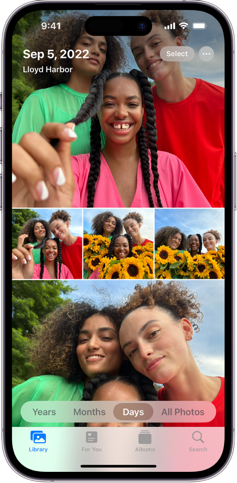
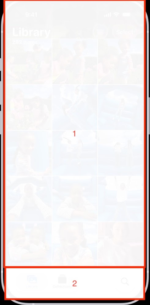
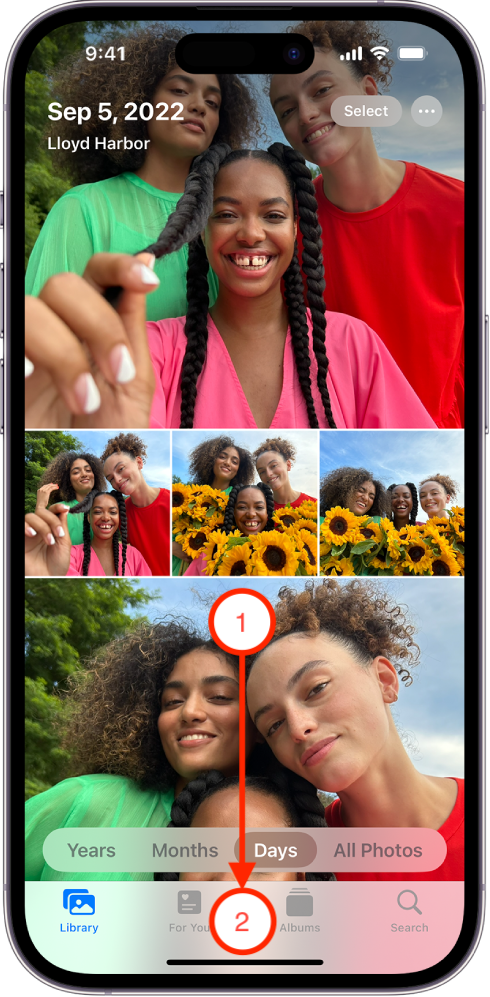
Before this redesign, Photos for iOS 17 was a model of simplicity. The app’s four bottom tabs — Library, Albums, For You, and Search — were a masterclass in intuitive hierarchy. They mirrored how people naturally think about their photos: as personal archives, not infinite feeds.
Navigation — The Tab Bar Paradox
From Apple’s own Human Interface Guidelines: “Tab bars help people understand the different types of information or functionality that an app provides. They also let people quickly switch between sections while preserving the navigation state within each tab.”
The old Photos app embodied this perfectly. Each section had a clear mental model:
- Library for your personal timeline
- Albums for curation and shared collections
- For You for Apple’s automated “Memories”
- Search for exploration
Each tab was a doorway to a different kind of relationship with your images — a balance between control and discovery.
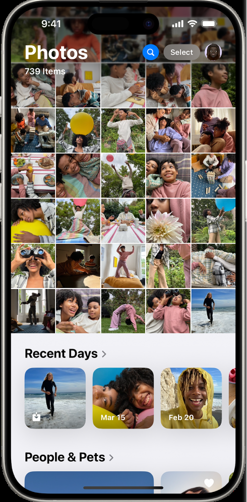
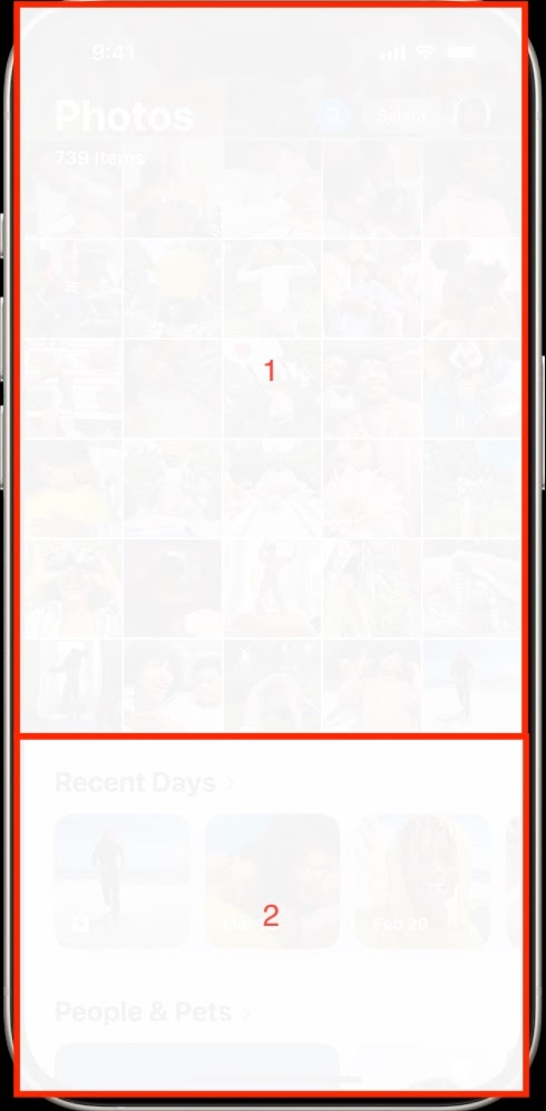
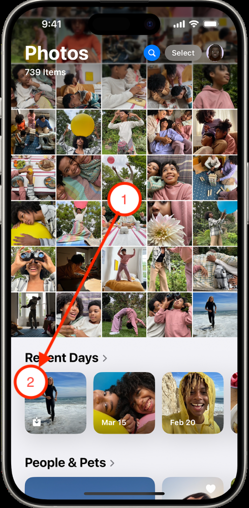
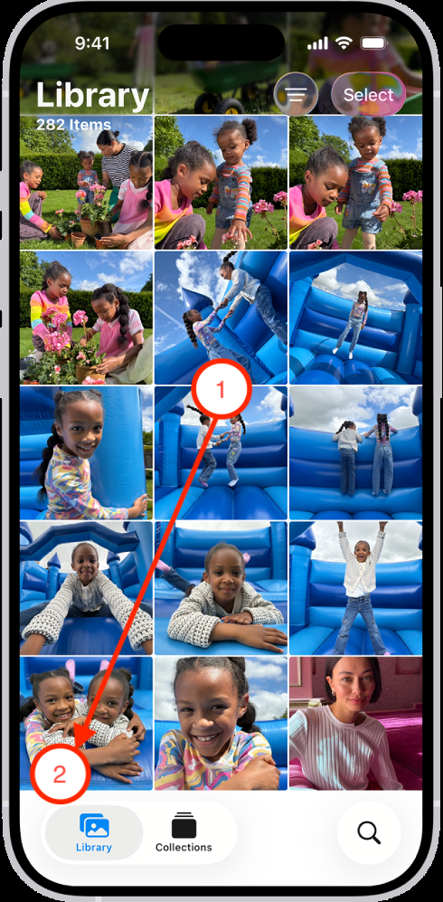
But in iOS 18, Apple replaced this clear structure with a continuous scroll. Instead of distinct sections, Photos now feels like one long, algorithmically generated feed. You swipe endlessly through categories that blend together: Recent Days, Trips, People & Pets, Pinned Collections.
Apple’s own guidelines warn against this: “If you hide the tab bar, people can forget which area of the app they’re in.”
That’s exactly what happened. The Photos app lost its sense of place — and, with it, part of its emotional resonance.

Hierarchy and Legibility
“Establish a clear visual hierarchy where controls and interface elements elevate and distinguish the content beneath them”
“Your typographic choices can help you display legible text, convey an information hierarchy, communicate important content, and express your brand or style.”
Apple once taught the world that typographic hierarchy equals usability. Larger fonts create anchors; contrast signals importance; white space gives breathing room.
In iOS 17, this design logic was alive and well. Section titles were clear and readable. The hierarchy between “Years,” “Months,” and “Days” views made it easy to zoom in and out through time — a metaphor that felt beautifully intuitive.
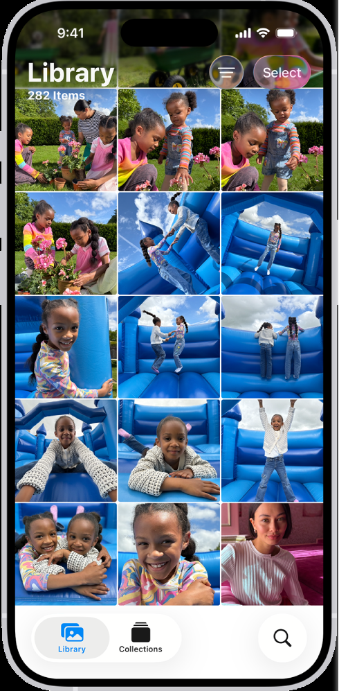
With iOS 18 and beyond, that hierarchy started to blur. Fonts became smaller, bolder titles disappeared, and the new “liquid glass” aesthetic introduced translucent backgrounds that look futuristic but read poorly.
Critics of Apple’s “liquid glass” style have pointed out that it reduces contrast and legibility, particularly for users with visual impairments. In the quest for depth and dimensionality, Apple sacrificed clarity.
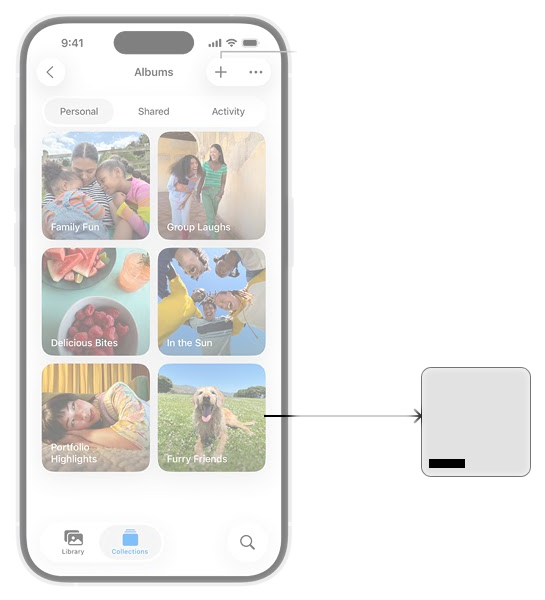
Collections and Control
Apple’s HIG for collections emphasizes clarity and control: “Use the standard row or grid layout whenever possible. Collections display content by default in a horizontal row or a grid, which are simple, effective appearances that people expect.”
“Use caution when making dynamic layout changes. The layout of a collection can change dynamically. Be sure any changes make sense and are easy to track.”
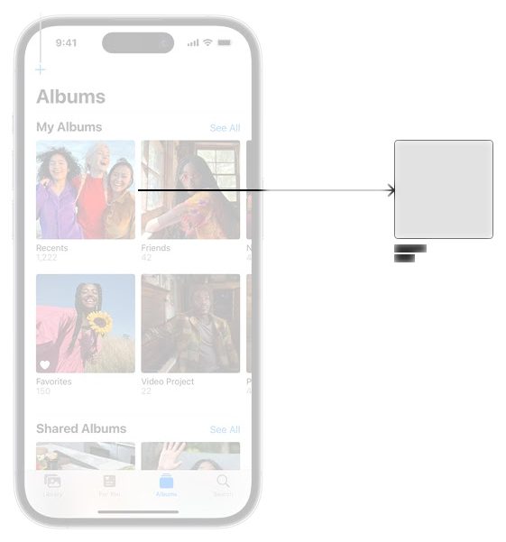
Photos 17 honored this. Users could easily build custom albums, favorite images, and find them again. That manual curation carried emotional weight: the albums we make ourselves are tied to the memories we cherish.
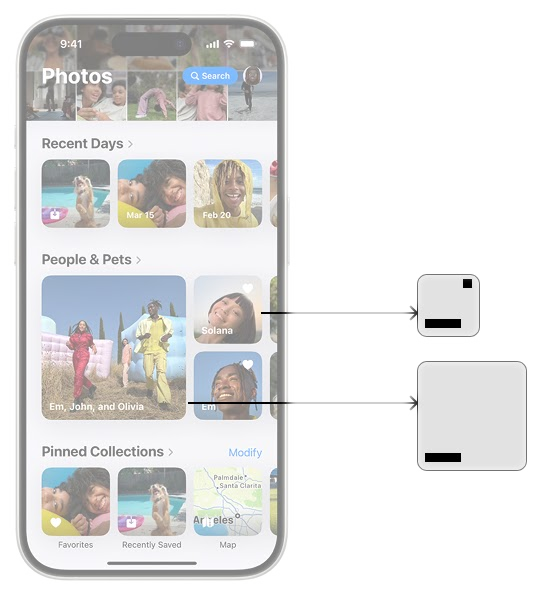
iOS 18+, however, shifted the emphasis toward AI-generated collections, adding Memories, Trips, People & Pets together with user-generated personal albums. While clever, these collections often lack the personal significance of human-created albums and should not be grouped into the same meta collection. They may highlight a vacation or a pet, but they don’t capture the nuance of what you care about.
Design for Scanning
“Intuitive. Your interface uses familiar and consistent interactions that make tasks straightforward to perform.”
This is crucial because people rarely read every detail on a screen. Instead, we scan, picking out the information that matters quickly.
In Photos 17, scanning was easy. Sections like Library, Albums, and For You were clearly separated. You could spot a favorite album, a recent memory, or a shared collection without thinking twice.
Continuous scroll, however, undermines this principle. A wall of photos followed by AI-generated sections makes it harder to locate what you want at a glance. Users must visually parse more information, hunt for context, and expend mental energy to interpret hierarchy. This is poorer UX — especially in an app designed for quick memory retrieval and reflection.
Search — From Utility to Discovery
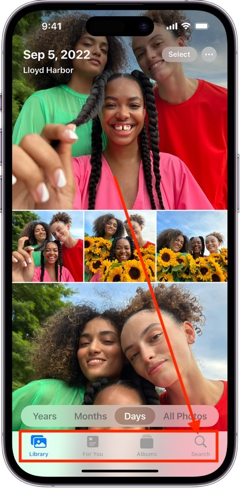
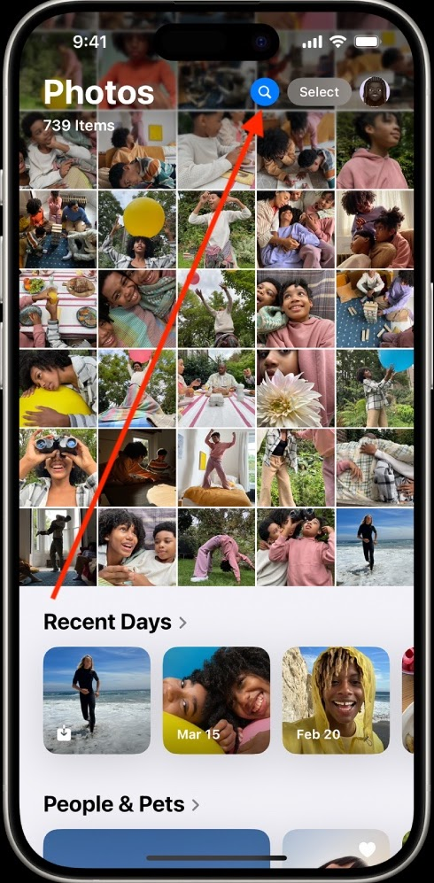
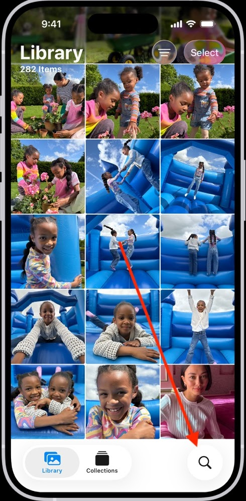
Search used to be immediate and visible. A top-bar search field invited action — no extra taps required.
In iOS 18, that bar is gone, replaced by a small magnifying-glass icon. Users must tap to access search, hiding the functionality behind an additional action.
Apple’s own guidelines state: “If search is important, consider making it a primary action… a search field is in the toolbar, making search clearly visible and easily accessible.”
The redesign emphasizes exploration rather than retrieval. But photos are personal archives, not content feeds. Hiding search behind gestures or icons reduces efficiency and contradicts Apple’s own advice.
Closing Reflection
The redesign of the Photos app raises more questions than answers. What could have driven these changes? Which users were interviewed to guide these decisions, and whose habits informed the new interface?
By emphasizing continuous scroll, conflating user-generated collections with AI-generated collections, and visual effects like liquid glass, the app feels fundamentally different. It challenges the way we navigate, scan, and emotionally connect with our photos.
Perhaps the path forward lies in balancing innovation with the emotional trust users have placed in the app. Apple Photos isn’t just software — it’s a memory keeper. And memory keepers need to be predictable, accessible, and respectful of the stories they hold.