Apple Photos on iOS 17 wasn’t flashy, but it worked. Millions of users had built daily habits around it — reviewing recent photos, browsing vacation albums, and reliving memories of loved ones. Unlike social media feeds, the Photos app was a personal memory archive, not a dopamine machine.
For many, it was the modern replacement for the physical photo albums we once cherished: the first steps of a child, Grandma’s last birthday, a graduation with friends you still keep in touch with. We use it to relive birthdays, trips, and the small, forgotten screenshots that mark our digital lives. No one opens the Photos app expecting it to behave like a social network. We open it to remember. The Photos app is the modern equivalent of a family photo album — an emotional archive of who we are.
The emotional weight shaped the design of iOS 17. Apple Photos wasn’t about endless scrolling or algorithmic feeds — it was about control, predictability, and emotional resonance.
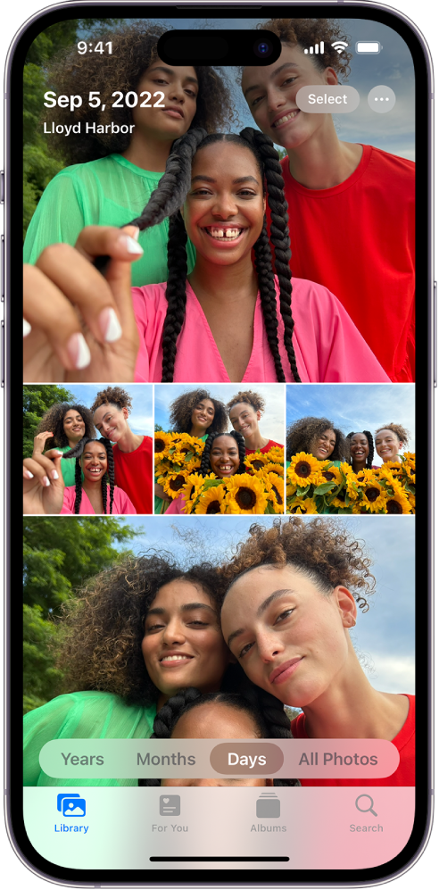
The iOS 17 Structure
iOS 17 featured a hierarchical organization that was intuitive and deliberate. Each tab represented a clear mental model: Library to browse time, Albums for organization, For You for curated memories, and Search for retrieval. Users had developed muscle memory: tapping “Albums” then scrolling to a favorite. Everything felt predictable and under their control. Even small actions, like creating an album or favoriting photos, were obvious and immediate.
iOS 17 respected Apple’s own Human Interface Guidelines — the foundation of good iOS design. The guidelines state that “Tab bars help people understand the different types of information or functionality an app provides. They also let people quickly switch between sections while preserving the current navigation state within each section.” That simple rule captures why Photos 17 worked so well — you could jump between Library, Albums, or For You without losing your place. Navigation was spatial, predictable, and emotionally grounded.
Apple Knew What They Had
Apple knew what they had in their hands. So deliberate was the old design that Apple made it explicit in their marketing of the iPhone’s camera and Photos ecosystem.
In 2017’s “Take Mine” ad, a young woman visits her grandmother in a Greek village. She takes a portrait, shows it to her grandmother — and soon the whole town lines up to be photographed. It’s storytelling about connection, family, and shared joy — not technology.
In “The Archives”, an archivist sorts through boxes of old photos and film reels, assembling them into a montage that ends on the iPhone’s Memories feature. Again — emotion, not algorithms.
The long-running “Shot on iPhone” campaign turned real user photos into billboards worldwide. Everyday moments — laughter, clouds, faces, pets — elevated through simplicity and authenticity.
The emotional appeal from Apple’s ads is not a coincidence. They knew that the best way to market their Camera and Photos app was appealing to emotion and respect for memory.
What Changed
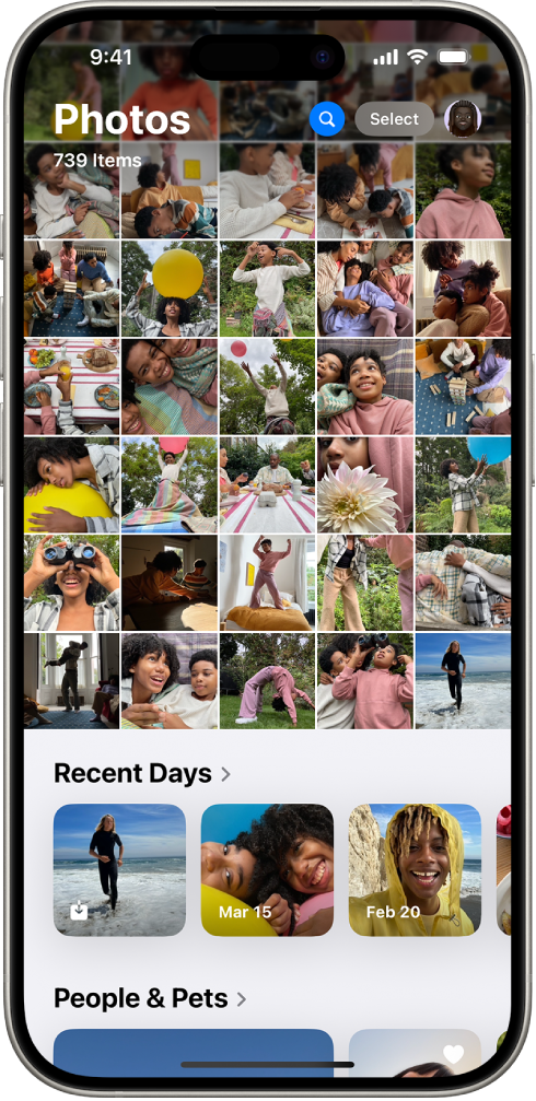
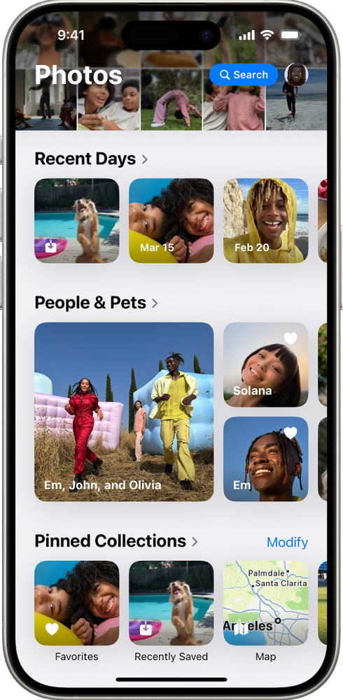
It seems like from iOS 18 onwards, Apple abandoned that emotional connection with their customers. Apple redesigned Photos around a continuous scroll, removed the clear tabbed structure, and leaned heavily on AI-generated categories like “Recent Days,” “Trips,” and “Pinned Collections.” The emphasis shifted from manual curation and nostalgia to algorithmic discovery and visual feeds. A grid of images now dominated the main screen, encouraging endless scrolling — more Instagram, less memory archive.
What Was Lost
- Muscle memory: The old tab navigation (Library, Albums, For You, Search) was replaced with nested scrolling. Users had to relearn basic interactions.
- Context: With fewer clear hierarchies, it became easy to lose track of where you were.
- Emotional pacing: “Memories” and “Albums” were buried below a visually dense grid.
- Manual curation: User-created albums became less visible.
- Search usability: Reduced to a small icon instead of a persistent search bar.
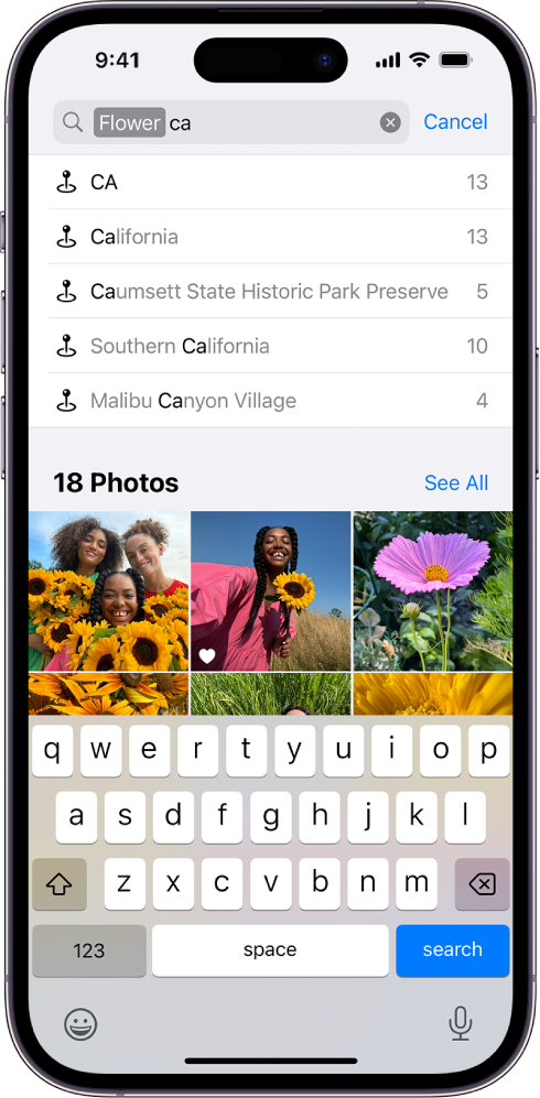
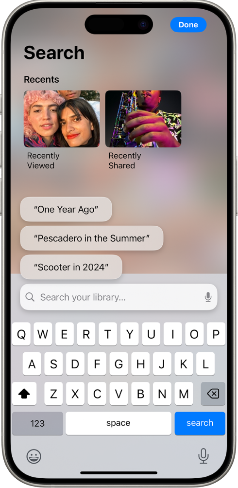
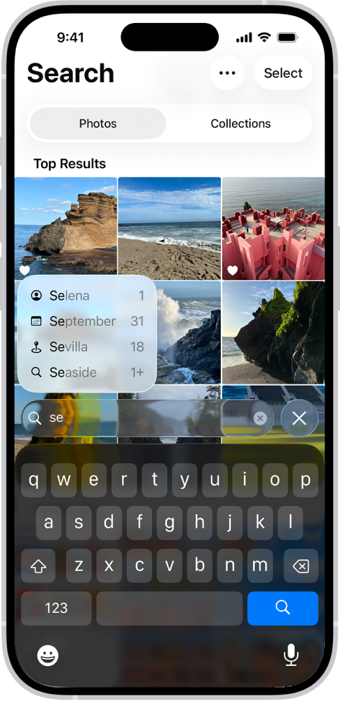
Apple’s own HIG cautions designers: “Make sure the tab bar is visible when people navigate to different sections of your app. If you hide the tab bar, people can forget which area of the app they’re in.” Yet that’s exactly what happened. By removing the persistent navigation bar, Photos lost a sense of hierarchy — a fundamental principle Apple itself once treated as sacred.
The Album Experience Across Versions
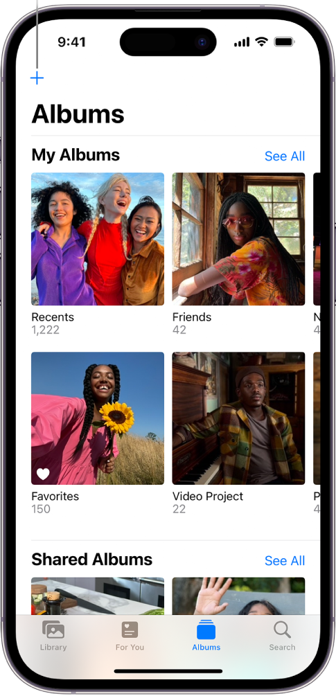
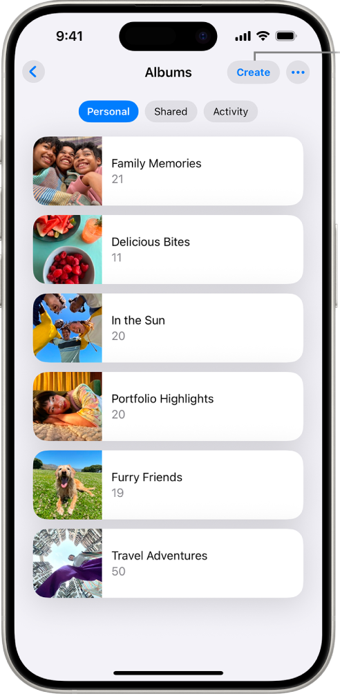
For iOS 18, Apple moved user-created albums to a child view nested in the navigation of the main scroll view. Apple added a segment controller (personal | shared | activity) to help filter album types. A list of horizontal cards gave more area to titles and facets over image previews. The call to action changed to “create” and became harder to distinguish from the segment controller. It’s also difficult to scan since its neighbor is a three-dot button with no clear purpose.
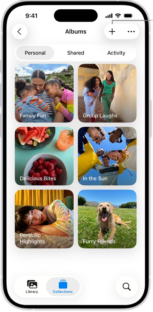
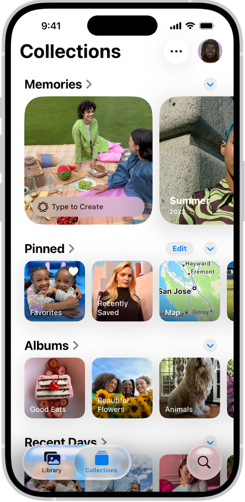
Apple kept the child view navigation for iOS 26 and switched back to the ”+” call to action but kept the mysterious three-dot button. The user must tap it to discover its function. The segment controller now reads more clearly as a segment controller. Apple added a bottom tab bar navigation that works more like a segment controller with a search button. Cards returned but text sometimes is hard to read because of the overlay effect.
Hierarchy Lost
Apple’s HIG explicitly recommends that apps maintain clear hierarchy and use visual structure (such as tabs, titles, and font size) to orient the user. In iOS 18 and 26, that clarity dissolved: the continuous scroll flattened every section, turning what used to be spatial navigation into a temporal feed. Instead of a structured mental model, users now face a blur of collections with no clear “top” or “depth.” This undermines the emotional rhythm of the Photos experience — the difference between visiting memories intentionally and just scrolling through noise.
iOS 17 album tabs had bold fonts and varying sizes that created hierarchy and readability. Album cards displayed image previews, titles, and facets with a clear ”+” button for adding albums. The word “Album” was prominently featured to provide an anchor to the app.
iOS 18 changed how albums display as part of the scroll view. Bold fonts still anchor collections visually, but the chevron ”>” character plus different card sizes diminishes hierarchy. This makes the app hard to scan visually. Small white fonts on images sometimes fail due to contrast. The overall view seems crowded and difficult to navigate.
iOS 26 separated collections to a new tab, abandoning the scroll concept. Memories appear larger, suggesting Apple still believes the app is about emotional connections, but albums below still look crowded. Readability issues persist: Liquid Glass makes reading and scanning text even harder. A floating “Tap to create” prompt adds to visual confusion.
A Note on Font Legibility
Apple’s early HIG guidance emphasized legibility through hierarchy — using larger, bolder text for top-level navigation and lighter text for secondary content. But in iOS 18 and especially iOS 26, Apple’s new Liquid Glass aesthetic — with translucent panels and reduced contrast — breaks this rule. Font sizes for navigation bars, labels, and tab text have become smaller and thinner, often rendered over semi-transparent backgrounds. This shift may look modern, but it makes reading harder, especially in sunlight or for users with low vision.
The iOS 17 version felt almost like those manual labelling stickers once used to annotate albums. Clearly legible and effective. The new font size selection plus the Liquid Glass effect is almost akin to writing labels with sparkling glossy pens that make fonts illegible.
In the next part, we’ll explore how these design choices measure up against Apple’s own Human Interface Guidelines — and why these patterns matter for real users.